Earthy Kitchen Colours 2026: The Palette Shift Every Luxury Kitchen Needs
Why cool greys are fading and earthy, saturated kitchen colours are defining 2026. From sage green and terracotta to deep plum and burnt umber — how to choose, test, and live with the new warm palette in a bespoke kitchen.
There is a moment in every decade's kitchen story when the reigning palette quietly loses its authority. For the better part of fifteen years, cool grey held the throne — polite, inoffensive, and about as thrilling as a Tuesday afternoon in an airport lounge. It paired well with everything. It offended no one. It said absolutely nothing.
That moment has passed.
The earthy kitchen colours defining 2026 are warmer, braver, and altogether more interesting. Sage green, terracotta, ochre, deep plum, burnt umber, forest green, oxidised copper, warm putty, and clay — these are colours with biography, drawn from the natural world rather than a colour-matching algorithm. They have the confidence to make a room feel like something, rather than carefully avoiding feeling like anything at all.
If you are considering a new kitchen and the words "something warm, but not boring" have crossed your mind, read on. This is the definitive guide to the earthy colour shift — what it means for luxury kitchen design, how to get it right, and how to avoid the mistakes that turn a beautiful palette into an expensive regret.
Why Cool Greys Are Fading
It is worth understanding why grey dominated so thoroughly before we bury it. Cool grey — particularly the blue-toned varieties that flooded every kitchen showroom from 2012 onwards — succeeded because it felt modern, clean, and safe. Estate agents loved it. Developers loved it. It photographed well and it sold houses.
But safety is not the same as satisfaction. Cool grey kitchens, for all their photogenic poise, can feel sterile after a few years of living with them. They lack the warmth that makes a kitchen feel inviting on a dark January evening. They can drain the natural light from a north-facing room rather than enhancing it. And there is only so much personality you can extract from a colour that was essentially designed to disappear.
The shift toward earthy kitchen colours is not a rejection of restraint — it is a rejection of blandness. The new palette is still sophisticated, still considered, still entirely appropriate for a serious kitchen. It simply has a pulse.
The broader cultural movement helps explain the timing. After years spent staring at screens in minimalist white rooms, there is a collective appetite for warmth, texture, and the kind of visual nourishment that only natural tones provide. Biophilic design — the principle of bringing natural elements into the built environment — has moved from architectural theory to kitchen practice. Earthy colours are the most immediate way to make a room feel connected to the world outside the window.
The Earthy Palette: A Colour-by-Colour Guide
Not all earthy tones are created equal, and understanding the character of each colour is essential before committing several thousand pounds of cabinetry to it.
Sage Green
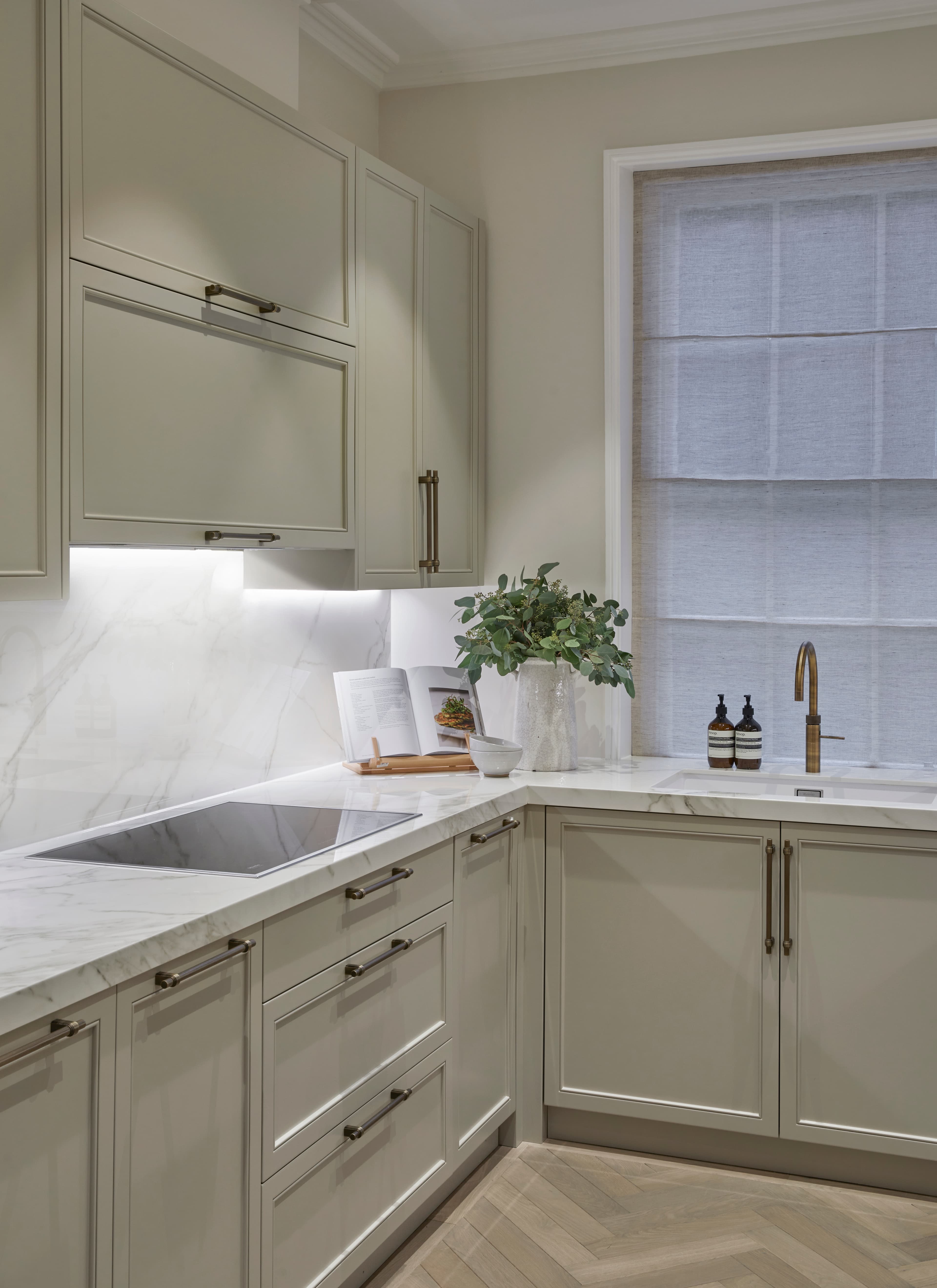
The quiet diplomat of the earthy palette. Sage is soft enough to live with comfortably but complex enough to hold visual interest across different lights. It works in virtually any kitchen style — as happy in a classic Shaker as in a contemporary handleless design. Sage reads warm in candlelight and cool in daylight, which gives it a chameleon quality that few other colours can match.
Terracotta
The extrovert. Terracotta has moved firmly from the Mediterranean holiday villa to the English country kitchen, and it has earned its place. In its more muted, clay-toned variations, it brings extraordinary warmth without the brashness of orange. It is particularly effective on an island or a statement larder, where it can be admired without overwhelming the room.
Ochre
Golden, grounding, and slightly unexpected in a kitchen context — which is precisely its appeal. Ochre works beautifully in rooms with abundant natural light, where it glows rather than shouts. It pairs superbly with dark timber and aged brass, and it has the useful quality of making everyone in the room look rather well.
Warm Putty
For those who want warmth without drama. Putty is the earthy palette's answer to the neutral — a colour that feels substantial enough to notice but restrained enough to live with for decades. It is the shade we most often recommend as a whole-kitchen colour, because it has the quiet confidence to cover every cabinet without becoming monotonous.
Deep Plum
Bold, unapologetically rich, and not for the faint-hearted. Deep plum in a kitchen is a statement of intent — this is a colour that says the owner has opinions and is not remotely interested in resale value as a design principle. Used judiciously — on an island, a pantry interior, or a bank of tall units — it is magnificent. Used on every surface, it needs very careful handling and excellent lighting.
Forest Green
If sage is the diplomat, forest green is the aristocrat. Dark, saturated, and deeply sophisticated, it has a long pedigree in British interiors and feels entirely natural in a kitchen setting. It works particularly well in period properties where the architecture can hold its own against a strong colour. Forest green paired with brass hardware and marble worktops is one of the most handsome combinations in contemporary kitchen design.
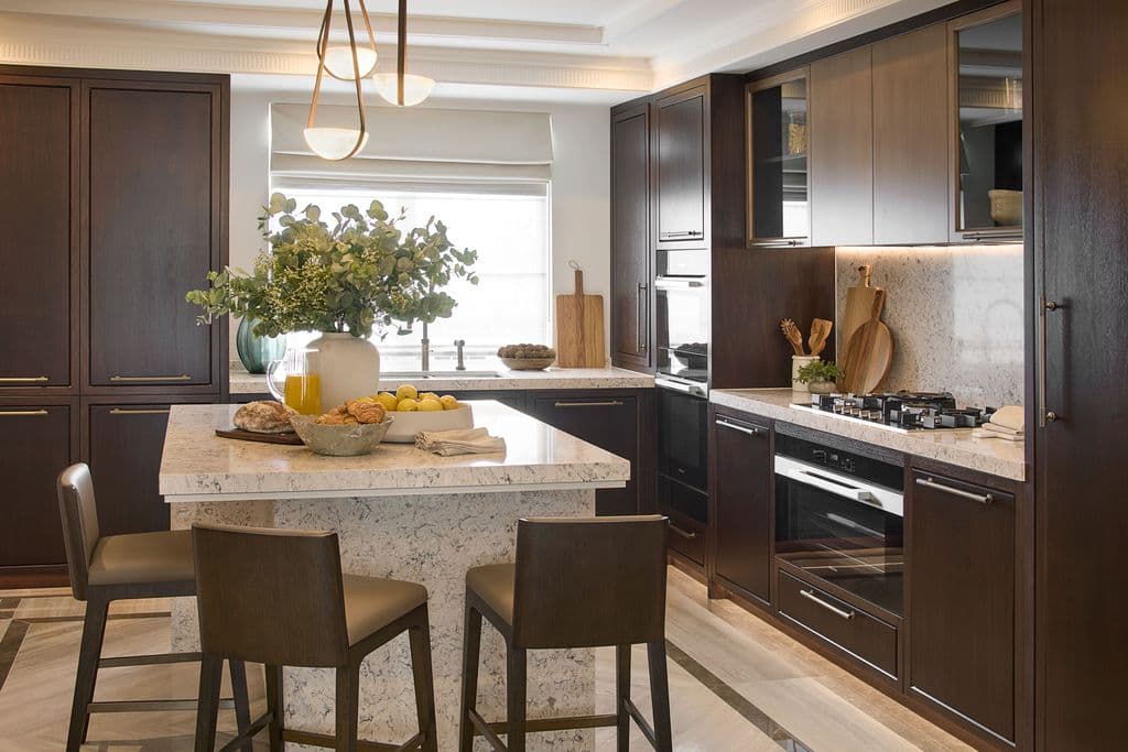
Burnt Umber, Oxidised Copper, and Clay
These warmer, browner tones form the earthiest end of the spectrum. They evoke raw plaster, weathered metal, and unglazed pottery — materials with history and texture. In a bespoke kitchen, they bring an organic quality that is almost impossible to achieve with cooler tones. They are particularly effective in barn conversions, farmhouses, and other properties where the architecture itself is honestly rustic.
Pairing Earthy Colours with Natural Materials
Colour does not exist in isolation. An earthy palette only reaches its potential when the materials surrounding it speak the same language.
The principle is straightforward: pair painted surfaces with materials that feel as though they were shaped by nature rather than manufactured by industry. This is where bespoke kitchen design has an enormous advantage over off-the-shelf alternatives — you are not limited to the three worktop options in a brochure.
Stone worktops are the natural partner. Honed marble with warm veining — think Calacatta Oro or a honey-toned limestone — sits beautifully alongside sage, putty, and plum. The slight variation in natural stone echoes the organic imperfection of earthy colour, creating a kitchen that feels grown rather than assembled.
Timber is equally sympathetic. Oiled oak, whether on worktops, open shelving, or an exposed frame, introduces a grain and warmth that amplifies the earthy palette. Walnut, with its darker, more chocolate tones, pairs particularly well with terracotta, ochre, and forest green. Even a modest run of open timber shelving against painted cabinetry can transform the feel of a kitchen.
Natural stone or terracotta flooring completes the picture. A flagstone or limestone floor grounds the room in a way that engineered alternatives struggle to replicate. The variation in tone and texture from slab to slab creates a foundation that feels permanent and honest — precisely the qualities that earthy kitchen colours are trying to achieve above floor level.
What to avoid: high-gloss surfaces, heavily processed materials, and anything that looks as though it is pretending to be something it is not. Earthy palettes and laminate countertops are not natural allies.
How Paint Brands Interpret Earthy Tones
One of the pleasures of working with earthy kitchen colours is the depth of choice available from the heritage paint brands. The same colour name — sage, for instance — can mean dramatically different things depending on who mixed it.
Farrow & Ball
The most recognisable name in British paint, and for good reason. Their earthy range has expanded significantly, with colours like Vert de Terre, Treron, and Oxford Stone offering nuanced, complex tones that shift beautifully across the day. Farrow & Ball paints have a characteristic depth that comes from their high pigment content and flat, chalky finish. They are the brand we use most frequently in hand-painted cabinetry, because their finishes respond particularly well to the gentle sheen of an eggshell or estate finish.
Little Greene
Often overlooked in favour of its more famous competitor, Little Greene deserves serious consideration. Their colour range is vast and meticulously researched, with many shades drawn from historical British interiors. Colours like Sage Green, Tuscan Red, and Edith sit beautifully in the earthy spectrum, and their paint quality is exemplary. For clients who want an earthy palette that feels grounded in British decorative history, Little Greene is a superb choice.
Edward Bulmer
The purist's option. Edward Bulmer Natural Paint uses only earth and mineral pigments, which means their earthy tones are literally of the earth. The resulting colours have an organic softness that synthetic pigments cannot replicate. Colours like Ochre, Invisible Green, and Cuisse de Nymphe are not only beautiful but carry genuine ecological credentials. For a kitchen where sustainability matters as much as aesthetics, Bulmer paints are worth every penny.
The practical implication for a bespoke kitchen project is this: do not choose your colour from a fan deck alone. Different paint brands produce genuinely different results from what appears to be the same shade. A sage from Farrow & Ball, a sage from Little Greene, and a sage from Edward Bulmer will look like three quite different colours on your cabinetry — and all three will look different again in your particular room, with your particular light.
Using Colour in Different Kitchen Elements
One of the questions we are asked most frequently is not which colour, but where. The answer depends on your appetite for commitment and your tolerance for boldness.
Full Cabinet Colour
Painting every cabinet in a single earthy tone is the most immersive approach, and it works beautifully when the colour is right. Sage green, warm putty, and softer clay tones are particularly well suited to this treatment, because they have the restraint to cover a large surface area without becoming oppressive. The effect is enveloping and cohesive — the kitchen feels like a single, considered gesture rather than a collection of parts.
Island Contrast
If full commitment feels daunting, the island is the ideal place to introduce a bolder earthy colour. A deep plum or forest green island set against putty or pale stone perimeter cabinetry creates a natural focal point and adds depth to the room without overwhelming it. This approach also has the practical advantage of being relatively easy to repaint if your taste evolves — repainting a single island is a morning's work compared with repainting an entire kitchen.
The Pantry as Colour Laboratory
Walk-in pantries and larder cupboards offer a wonderful opportunity to experiment with colour in a more contained space. A terracotta or ochre pantry interior, revealed when the doors open, creates a moment of surprise and delight without requiring you to live with a bold colour on permanent display. Several of our clients have used the pantry as a testing ground — trying a colour there before committing to it on the main cabinetry. It is one of our favourite design moves in a walk-in pantry.
Upper Cabinets, Lower Cabinets, and the Art of Contrast
A more nuanced approach involves painting upper and lower cabinetry in two related tones — a deeper colour below, a lighter shade above. This creates the illusion of height and lightness while grounding the room visually. Forest green below with a warm off-white above, for instance, or terracotta lower cabinets beneath sage uppers. The trick is to keep both colours within the same tonal family so the kitchen feels deliberately composed rather than accidentally mismatched.
Testing Colours: Why Samples on Paper Lie
Here is the single most important piece of colour advice we can offer, and it costs nothing: do not trust paint swatches, sample pots on scraps of card, or digital colour renderings. They are all, to varying degrees, liars.
A paint colour changes depending on the surface it covers, the light it receives, and the colours surrounding it. A swatch of Farrow & Ball's Treron on a small card in a showroom bears only a passing resemblance to the same colour on a full-height painted cabinet in a north-facing kitchen in February. The relationship is distant. They may have been introduced at a party once.
The proper way to test kitchen colours:
Paint large boards. Buy sample pots and paint pieces of MDF or plywood at least A2 in size. A small sample is useless because your eye averages it with the surrounding colour — you are testing the wall behind it as much as the paint.
Move them around the room. Prop the boards against different walls, at different times of day. Watch how they behave in morning light, in afternoon shadow, in evening lamplight, and under your planned kitchen lighting. A colour that sings at noon may sulk at six o'clock.
Test against your fixed elements. Hold the board against your flooring, your worktop sample, your chosen hardware. Colours interact with their neighbours constantly, and a shade that looks warm on its own may turn cold against certain stones.
Live with them. Leave the boards up for a week. First impressions are unreliable — what thrills you on day one may exhaust you by day five. Conversely, a colour that seems quiet initially may reveal a depth and character that only emerges over time.
This process takes patience, but it is the difference between a kitchen colour you love and one you learn to tolerate. Given that a bespoke kitchen will be with you for twenty years or more, a week of testing is not an extravagant investment.
Warm Metallics That Complement Earthy Palettes
If cool grey kitchens found their natural partner in brushed nickel and polished chrome, earthy palettes demand warmer metallic companions. The shift in colour brings with it a corresponding shift in hardware, taps, and fixtures.
Brass
Unlacquered brass is the first choice for many of our earthy kitchen projects. It arrives bright and golden, then develops a warm, lived-in patina over time that deepens alongside the character of the kitchen. Aged brass handles against forest green or sage cabinetry is a combination of such enduring beauty that it borders on unfair to everything else in the room.
Copper
Bolder and more overtly warm than brass, copper brings an artisan quality that suits the earthier end of the palette. Copper taps, pendant lights, or a statement range hood can become the room's jewellery — particularly effective against terracotta, burnt umber, and clay tones. Like brass, it ages gracefully, developing a patina that echoes the organic character of the cabinetry colour.
Bronze
Darker and more subdued than either brass or copper, bronze is the metallic for those who want warmth without glint. It suits deeper colour palettes — plum, forest green, and the richer umbers — where a less reflective metal feels more appropriate. Bronze hardware has a quiet authority that complements rather than competes with bold cabinetry colours.
The common thread is warmth. Cool metals — chrome, brushed nickel, stainless steel — can work alongside earthy palettes, but they introduce a temperature conflict that requires careful management. Warm metals, by contrast, simply agree with the programme.
The Psychology of Warm Kitchen Colours
There is a reason we instinctively associate certain colours with comfort, and it is not entirely cultural. Warm tones — the reds, oranges, yellows, and browns that make up much of the earthy palette — stimulate the brain differently from cool tones. They are associated with warmth, nourishment, and safety, which is why restaurants have been painting their dining rooms in warm colours since long before colour psychology had a name.
In a kitchen — the room where we nourish, gather, and spend more waking hours than any other — this matters. A kitchen painted in sage green or warm putty genuinely feels more welcoming than one in cool grey or stark white. Guests linger longer. Conversations start more easily. The room invites you to stay rather than merely to cook and leave.
This is not to suggest that warm colours are objectively better. A cool, minimalist kitchen can be a thing of great beauty. But for families who want their kitchen to be the emotional heart of the home — which is to say, most of our clients — earthy colours offer a warmth that goes beyond mere temperature.
There is also the question of appetite. Warm tones are known to stimulate appetite and make food look more appetising, which is a useful quality in a room devoted to eating. Whether this is a benefit or a hazard depends on your relationship with the biscuit tin.
Earthy Kitchens in Different Property Styles
One of the great advantages of the earthy palette is its versatility across architectural styles. Where cool grey sometimes struggled to feel at home in older properties — too contemporary for a Tudor beam, too cold for a Georgian dining kitchen — earthy tones have an inherent compatibility with almost any building.
Period Properties
Earthy colours feel entirely natural in period homes. Georgian townhouses take beautifully to sage, warm putty, and the heritage greens that would have been familiar to the original occupants. Victorian terraces suit the bolder end of the spectrum — deep plum, forest green, and rich terracotta — where the architectural confidence of the building can support a strong colour statement. Edwardian and Arts and Crafts homes, with their emphasis on natural materials and honest craftsmanship, are perhaps the most natural hosts for the earthy palette.
Barn Conversions and Country Properties
This is where earthy colours are at their most effortless. The raw textures of exposed brick, timber frame, and stone walls provide a ready-made context for terracotta, burnt umber, clay, and ochre. A kitchen in warm putty or sage green against a backdrop of exposed oak beams is so naturally harmonious that it can feel as though the colour emerged from the building itself. Our guide to English country kitchen design explores this territory in depth.
Modern and New-Build Properties
Perhaps surprisingly, earthy colours work just as well in contemporary settings — they simply need a different framing. In a modern open-plan space, a forest green or deep plum kitchen becomes a sculptural element, its rich colour providing the visual anchor that modern architecture sometimes lacks. Clean lines and minimal detailing allow the colour to speak without competition. Against pale walls, concrete floors, or large expanses of glazing, an earthy kitchen can be breathtaking.
The M11 Corridor Mix
Our clients along the M11 corridor live in everything from medieval farmhouses to brand-new executive homes, and the earthy palette serves all of them. The ability to dial the intensity up or down — from a full terracotta statement to a whisper of warm putty — means that the palette adapts to the property rather than demanding the property adapt to it.
Making the Commitment
Choosing a kitchen colour is not quite as permanent as choosing a spouse, but it is a longer commitment than most people realise. A bespoke kitchen built to last twenty-five years or more will live through multiple decorating refreshes of the surrounding room. The cabinetry colour is the constant around which everything else rotates.
This is why the earthy palette is such a sound investment. These are not novelty colours or fleeting fads — they are tones that have existed for as long as humans have been mixing pigments from the ground beneath their feet. Sage green was beautiful in a Georgian drawing room in 1790 and it will be beautiful in your kitchen in 2046. Terracotta has adorned walls since the Romans had opinions about interior design. Deep plum has never gone out of style because it never needed to be in style in the first place.
The practical steps are straightforward. Test rigorously, as outlined above. Consider how the colour interacts with your light, your materials, and your daily life. Think about where in the kitchen the colour will have the most impact — and where restraint might serve you better.
And if you would like to think through the possibilities with someone who has been helping clients navigate exactly these decisions for years, our design consultation is the place to begin. We will bring the sample boards. You bring the biscuits.
At Albury House, earthy kitchens are not a trend we are following — they are a sensibility we have always understood. The difference now is that the rest of the world has caught up.
Where to Start
If the earthy palette has piqued your interest, a few next steps:
- Browse our kitchen design trends for 2026 for the broader context of where kitchen design is heading this year.
- Read about hand-painted kitchen cabinets to understand why the paint finish matters as much as the colour itself.
- Explore classic kitchen design ideas for inspiration that transcends passing fashion.
- Get in touch to discuss your project. We are based in Hertfordshire and work across the M11 corridor, from Cambridge to North London — and we always have sample boards ready.
Frequently Asked Questions
Thinking about a new kitchen?
Book Your Free ConsultationYou might also enjoy
Kitchen Design Trends 2026: The Definitive Guide to What's Shaping Luxury Kitchens This Year
The 10 kitchen design trends defining 2026 — from the return of real wood and earthy colour palettes to sculptural islands, hidden sculleries, and the quiet triumph of handcraft over mass production. An authoritative guide from Albury House Kitchens.
Matte Kitchen Finishes: Why the Quiet Surfaces Are Having Their Moment
The definitive guide to matte finishes in luxury kitchen design — from matt lacquer cabinetry and honed stone worktops to brushed brass hardware and limewash paint. How to use texture, sheen, and restraint to create a kitchen that feels as good as it looks.
The Return of Real Wood Kitchens: Why Natural Timber Is the Defining Trend of 2026
After two decades of painted cabinetry, real wood kitchens are making a remarkable comeback. We explore the timbers, finishes, and design philosophies driving the return to natural, unpainted kitchen cabinetry.